7 Case study: comparing Twitter archives
One type of text that gets plenty of attention is text shared online via Twitter. In fact, several of the sentiment lexicons used in this book (and commonly used in general) were designed for use with and validated on tweets. Both of the authors of this book are on Twitter and are fairly regular users of it, so in this case study, let’s compare the entire Twitter archives of Julia and David.
7.1 Getting the data and distribution of tweets
An individual can download their own Twitter archive by following directions available on Twitter’s website. We each downloaded ours and will now open them up. Let’s use the lubridate package to convert the string timestamps to date-time objects and initially take a look at our tweeting patterns overall (Figure 7.1).
library(lubridate)
library(ggplot2)
library(dplyr)
library(readr)

tweets_julia <- read_csv("data/tweets_julia.csv")
tweets_dave <- read_csv("data/tweets_dave.csv")
tweets <- bind_rows(tweets_julia %>%
                      mutate(person = "Julia"),
                    tweets_dave %>%
                      mutate(person = "David")) %>%
  mutate(timestamp = ymd_hms(timestamp))

ggplot(tweets, aes(x = timestamp, fill = person)) +
  geom_histogram(position = "identity", bins = 20, show.legend = FALSE) +
  facet_wrap(~person, ncol = 1)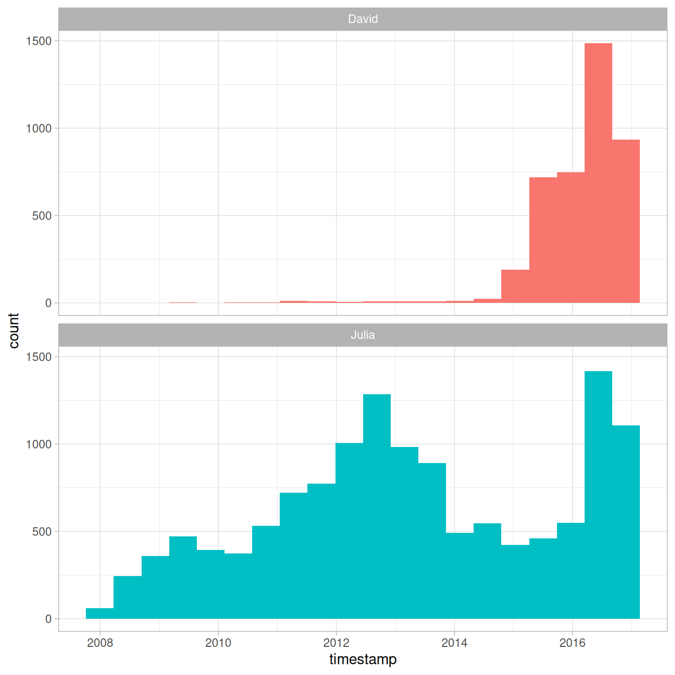
Figure 7.1: All tweets from our accounts
David and Julia tweet at about the same rate currently and joined Twitter about a year apart from each other, but there were about 5 years where David was not active on Twitter and Julia was. In total, Julia has about 4 times as many tweets as David.
7.2 Word frequencies
Let’s use unnest_tokens() to make a tidy data frame of all the words in our tweets, and remove the common English stop words. There are certain conventions in how people use text on Twitter, so we will use a specialized tokenizer and do a bit more work with our text here than, for example, we did with the narrative text from Project Gutenberg.
First, we will remove tweets from this dataset that are retweets so that we only have tweets that we wrote ourselves. Next, the mutate() line removes links and cleans out some characters that we don’t want like ampersands and such.
In the call to unnest_tokens(), we unnest using a regex
pattern, instead of just looking for single unigrams (words). This regex
pattern very useful for dealing with Twitter text or other text from
online forums; it retains hashtags and mentions of usernames with the
@ symbol.
Because we have kept text such as hashtags and usernames in the dataset, we can’t use a simple anti_join() to remove stop words. Instead, we can take the approach shown in the filter() line that uses str_detect() from the stringr package.
library(tidytext)
library(stringr)
replace_reg <- "https://t.co/[A-Za-z\\d]+|http://[A-Za-z\\d]+|&|<|>|RT|https"
unnest_reg <- "([^A-Za-z_\\d#@']|'(?![A-Za-z_\\d#@]))"
tidy_tweets <- tweets %>%
filter(!str_detect(text, "^RT")) %>%
mutate(text = str_replace_all(text, replace_reg, "")) %>%
unnest_tokens(word, text, token = "regex", pattern = unnest_reg) %>%
filter(!word %in% stop_words$word,
!word %in% str_remove_all(stop_words$word, "'"),
str_detect(word, "[a-z]"))Now we can calculate word frequencies for each person. First, we group by person and count how many times each person used each word. Then we use left_join() to add a column of the total number of words used by each person. (This is higher for Julia than David since she has more tweets than David.) Finally, we calculate a frequency for each person and word.
frequency <- tidy_tweets %>%
  count(person, word, sort = TRUE) %>%
  left_join(tidy_tweets %>%
              count(person, name = "total")) %>%
  mutate(freq = n/total)

frequency
#> # A tibble: 20,722 × 5
#>    person word               n total    freq
#>    <chr>  <chr>          <int> <int>   <dbl>
#>  1 Julia  time             584 74541 0.00783
#>  2 Julia  @selkie1970      570 74541 0.00765
#>  3 Julia  @skedman         531 74541 0.00712
#>  4 Julia  day              467 74541 0.00627
#>  5 Julia  baby             408 74541 0.00547
#>  6 David  @hadleywickham   315 20150 0.0156
#>  7 Julia  love             304 74541 0.00408
#>  8 Julia  @haleynburke     299 74541 0.00401
#>  9 Julia  house            289 74541 0.00388
#> 10 Julia  morning          278 74541 0.00373
#> # ℹ 20,712 more rows
This is a nice and tidy data frame but we would actually like to plot those frequencies on the x- and y-axes of a plot, so we will need to use pivot_wider() from tidyr make a differently shaped data frame.
library(tidyr)

frequency <- frequency %>%
  select(person, word, freq) %>%
  pivot_wider(names_from = person, values_from = freq) %>%
  arrange(Julia, David)

frequency
#> # A tibble: 17,629 × 3
#>    word                 Julia     David
#>    <chr>                <dbl>     <dbl>
#>  1 's               0.0000134 0.0000496
#>  2 1x               0.0000134 0.0000496
#>  3 5k               0.0000134 0.0000496
#>  4 @accidental__art 0.0000134 0.0000496
#>  5 @alice_data      0.0000134 0.0000496
#>  6 @alistaire       0.0000134 0.0000496
#>  7 @corynissen      0.0000134 0.0000496
#>  8 @jennybryan's    0.0000134 0.0000496
#>  9 @jsvine          0.0000134 0.0000496
#> 10 @lizasperling    0.0000134 0.0000496
#> # ℹ 17,619 more rows
Now this is ready for us to plot. Let’s use geom_jitter() so that we don’t see the discreteness at the low end of frequency as much, and check_overlap = TRUE so the text labels don’t all print out on top of each other (only some will print).
library(scales)

ggplot(frequency, aes(Julia, David)) +
  geom_jitter(alpha = 0.1, size = 2.5, width = 0.25, height = 0.25) +
  geom_text(aes(label = word), check_overlap = TRUE, vjust = 1.5) +
  scale_x_log10(labels = percent_format()) +
  scale_y_log10(labels = percent_format()) +
  geom_abline(color = "red")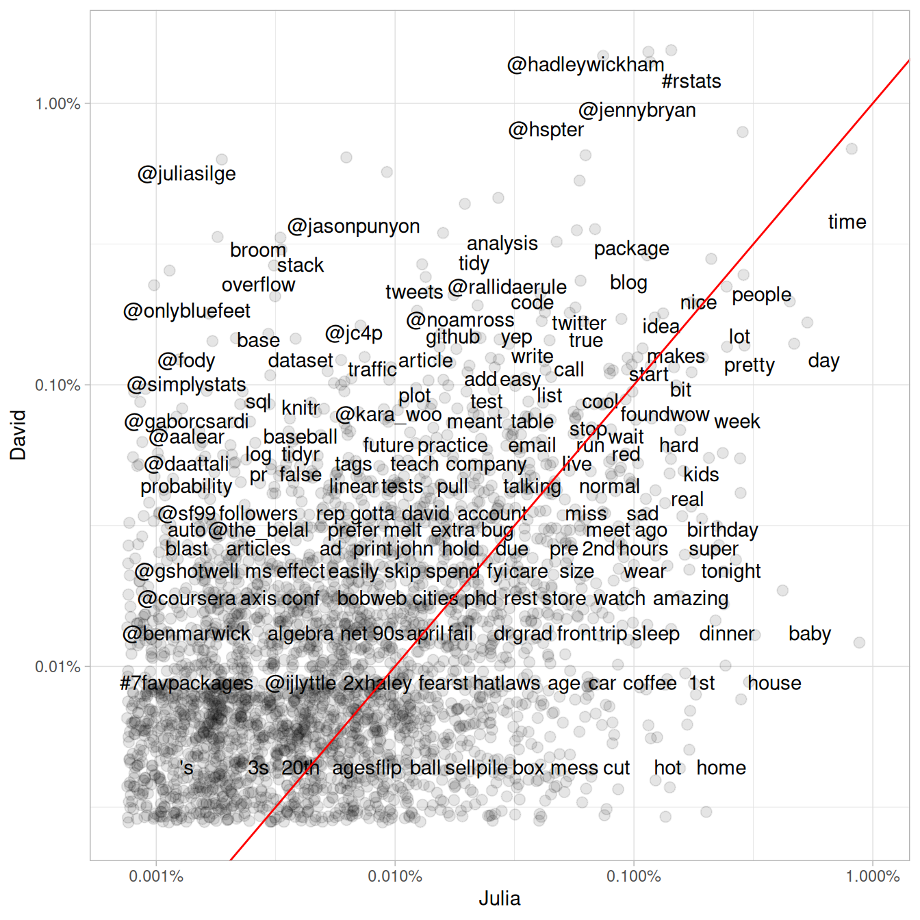
Figure 7.2: Comparing the frequency of words used by Julia and David
Words near the line in Figure 7.2 are used with about equal frequencies by David and Julia, while words far away from the line are used much more by one person compared to the other. Words, hashtags, and usernames that appear in this plot are ones that we have both used at least once in tweets.
This may not even need to be pointed out, but David and Julia have used their Twitter accounts rather differently over the course of the past several years. David has used his Twitter account almost exclusively for professional purposes since he became more active, while Julia used it for entirely personal purposes until late 2015 and still uses it more personally than David. We see these differences immediately in this plot exploring word frequencies, and they will continue to be obvious in the rest of this chapter.
7.3 Comparing word usage
We just made a plot comparing raw word frequencies over our whole Twitter histories; now let’s find which words are more or less likely to come from each person’s account using the log odds ratio. First, let’s restrict the analysis moving forward to tweets from David and Julia sent during 2016. David was consistently active on Twitter for all of 2016 and this was about when Julia transitioned into data science as a career.
tidy_tweets <- tidy_tweets %>%
  filter(timestamp >= as.Date("2016-01-01"),
         timestamp < as.Date("2017-01-01"))
Next, let’s use str_detect() to remove Twitter usernames from the word column, because otherwise, the results here are dominated only by people who Julia or David know and the other does not. After removing these, we count how many times each person uses each word and keep only the words used more than 10 times. After a pivot_wider() operation, we can calculate the log odds ratio for each word, using
\[\text{log odds ratio} = \ln{\left(\frac{\left[\frac{n+1}{\text{total}+1}\right]_\text{David}}{\left[\frac{n+1}{\text{total}+1}\right]_\text{Julia}}\right)}\]
where \(n\) is the number of times the word in question is used by each person and the total indicates the total words for each person.
word_ratios <- tidy_tweets %>%
  filter(!str_detect(word, "^@")) %>%
  count(word, person) %>%
  group_by(word) %>%
  filter(sum(n) >= 10) %>%
  ungroup() %>%
  pivot_wider(names_from = person, values_from = n, values_fill = 0) %>%
  mutate_if(is.numeric, list(~(. + 1) / (sum(.) + 1))) %>%
  mutate(logratio = log(David / Julia)) %>%
  arrange(desc(logratio))
What are some words that have been about equally likely to come from David or Julia’s account during 2016?
word_ratios %>%
  arrange(abs(logratio))
#> # A tibble: 377 × 4
#>    word         David   Julia logratio
#>    <chr>        <dbl>   <dbl>    <dbl>
#>  1 email      0.00229 0.00228  0.00463
#>  2 file       0.00229 0.00228  0.00463
#>  3 map        0.00252 0.00254 -0.00543
#>  4 names      0.00413 0.00406  0.0170
#>  5 account    0.00183 0.00177  0.0328
#>  6 api        0.00183 0.00177  0.0328
#>  7 function   0.00367 0.00355  0.0328
#>  8 population 0.00183 0.00177  0.0328
#>  9 sad        0.00183 0.00177  0.0328
#> 10 words      0.00367 0.00355  0.0328
#> # ℹ 367 more rows
We are about equally likely to tweet about maps, email, files, and APIs.
Which words are most likely to be from Julia’s account or from David’s account? Let’s just take the top 15 most distinctive words for each account and plot them in Figure 7.3.
word_ratios %>%
  group_by(logratio < 0) %>%
  slice_max(abs(logratio), n = 15) %>%
  ungroup() %>%
  mutate(word = reorder(word, logratio)) %>%
  ggplot(aes(word, logratio, fill = logratio < 0)) +
  geom_col(show.legend = FALSE) +
  coord_flip() +
  ylab("log odds ratio (David/Julia)") +
  scale_fill_discrete(name = "", labels = c("David", "Julia"))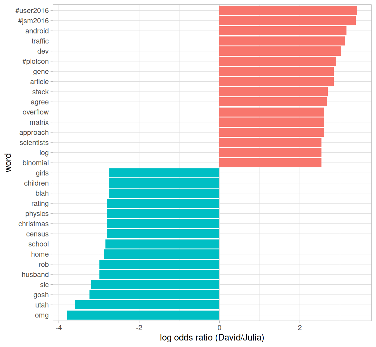
Figure 7.3: Comparing the odds ratios of words from our accounts
So David has tweeted about specific conferences he has gone to and Stack Overflow, while Julia tweeted about Utah, Census data, and her family.
7.4 Changes in word use
The section above looked at overall word use, but now let’s ask a different question. Which words’ frequencies have changed the fastest in our Twitter feeds? Or to state this another way, which words have we tweeted about at a higher or lower rate as time has passed? To do this, we will define a new time variable in the data frame that defines which unit of time each tweet was posted in. We can use floor_date() from lubridate to do this, with a unit of our choosing; using 1 month seems to work well for this year of tweets from both of us.
After we have the time bins defined, we count how many times each of us used each word in each time bin. After that, we add columns to the data frame for the total number of words used in each time bin by each person and the total number of times each word was used by each person. We can then filter() to only keep words used at least some minimum number of times (30, in this case).
words_by_time <- tidy_tweets %>%
  filter(!str_detect(word, "^@")) %>%
  mutate(time_floor = floor_date(timestamp, unit = "1 month")) %>%
  count(time_floor, person, word) %>%
  group_by(person, time_floor) %>%
  mutate(time_total = sum(n)) %>%
  group_by(person, word) %>%
  mutate(word_total = sum(n)) %>%
  ungroup() %>%
  rename(count = n) %>%
  filter(word_total > 30)

words_by_time
#> # A tibble: 327 × 6
#>    time_floor          person word    count time_total word_total
#>    <dttm>              <chr>  <chr>   <int>      <int>      <int>
#>  1 2016-01-01 00:00:00 David  #rstats     2        306        208
#>  2 2016-01-01 00:00:00 David  broom       2        306         39
#>  3 2016-01-01 00:00:00 David  data        2        306        165
#>  4 2016-01-01 00:00:00 David  ggplot2     1        306         39
#>  5 2016-01-01 00:00:00 David  tidy        1        306         46
#>  6 2016-01-01 00:00:00 David  time        2        306         58
#>  7 2016-01-01 00:00:00 David  tweets      1        306         46
#>  8 2016-01-01 00:00:00 Julia  #rstats    10        401        116
#>  9 2016-01-01 00:00:00 Julia  blog        2        401         33
#> 10 2016-01-01 00:00:00 Julia  data        5        401        111
#> # ℹ 317 more rows
Each row in this data frame corresponds to one person using one word in a given time bin. The count column tells us how many times that person used that word in that time bin, the time_total column tells us how many words that person used during that time bin, and the word_total column tells us how many times that person used that word over the whole year. This is the data set we can use for modeling.
We can use nest() from tidyr to make a data frame with a list column that contains little miniature data frames for each word. Let’s do that now and take a look at the resulting structure.
nested_data <- words_by_time %>%
  nest(data = c(-word, -person))

nested_data
#> # A tibble: 32 × 3
#>    person word    data
#>    <chr>  <chr>   <list>
#>  1 David  #rstats <tibble [12 × 4]>
#>  2 David  broom   <tibble [10 × 4]>
#>  3 David  data    <tibble [12 × 4]>
#>  4 David  ggplot2 <tibble [10 × 4]>
#>  5 David  tidy    <tibble [11 × 4]>
#>  6 David  time    <tibble [12 × 4]>
#>  7 David  tweets  <tibble [8 × 4]>
#>  8 Julia  #rstats <tibble [12 × 4]>
#>  9 Julia  blog    <tibble [10 × 4]>
#> 10 Julia  data    <tibble [12 × 4]>
#> # ℹ 22 more rows
This data frame has one row for each person-word combination; the data column is a list column that contains data frames, one for each combination of person and word. Let’s use map() from purrr (Henry and Wickham 2018) to apply our modeling procedure to each of those little data frames inside our big data frame. This is count data so let’s use glm() with family = "binomial" for modeling.
We can think about this modeling procedure answering a question like, “Was a given word mentioned in a given time bin? Yes or no? How does the count of word mentions depend on time?”
library(purrr)

nested_models <- nested_data %>%
  mutate(models = map(data, ~ glm(cbind(count, time_total) ~ time_floor, .,
                                  family = "binomial")))

nested_models
#> # A tibble: 32 × 4
#>    person word    data              models
#>    <chr>  <chr>   <list>            <list>
#>  1 David  #rstats <tibble [12 × 4]> <glm>
#>  2 David  broom   <tibble [10 × 4]> <glm>
#>  3 David  data    <tibble [12 × 4]> <glm>
#>  4 David  ggplot2 <tibble [10 × 4]> <glm>
#>  5 David  tidy    <tibble [11 × 4]> <glm>
#>  6 David  time    <tibble [12 × 4]> <glm>
#>  7 David  tweets  <tibble [8 × 4]>  <glm>
#>  8 Julia  #rstats <tibble [12 × 4]> <glm>
#>  9 Julia  blog    <tibble [10 × 4]> <glm>
#> 10 Julia  data    <tibble [12 × 4]> <glm>
#> # ℹ 22 more rows
Now notice that we have a new column for the modeling results; it is another list column and contains glm objects. The next step is to use map() and tidy() from the broom package to pull out the slopes for each of these models and find the important ones. We are comparing many slopes here and some of them are not statistically significant, so let’s apply an adjustment to the p-values for multiple comparisons.
library(broom)

slopes <- nested_models %>%
  mutate(models = map(models, tidy)) %>%
  unnest(cols = c(models)) %>%
  filter(term == "time_floor") %>%
  mutate(adjusted.p.value = p.adjust(p.value))
Now let’s find the most important slopes. Which words have changed in frequency at a moderately significant level in our tweets?
top_slopes <- slopes %>%
  filter(adjusted.p.value < 0.05)

top_slopes
#> # A tibble: 6 × 9
#>   person word      data              term   estimate std.error statistic p.value
#>   <chr>  <chr>     <list>            <chr>     <dbl>     <dbl>     <dbl>   <dbl>
#> 1 David  ggplot2   <tibble [10 × 4]> time_… -8.27e-8   1.97e-8     -4.20 2.69e-5
#> 2 Julia  #rstats   <tibble [12 × 4]> time_… -4.49e-8   1.12e-8     -4.01 5.97e-5
#> 3 Julia  post      <tibble [12 × 4]> time_… -4.82e-8   1.45e-8     -3.31 9.27e-4
#> 4 David  overflow  <tibble [10 × 4]> time_…  7.25e-8   2.23e-8      3.25 1.17e-3
#> 5 David  stack     <tibble [10 × 4]> time_…  8.04e-8   2.19e-8      3.67 2.47e-4
#> 6 David  #user2016 <tibble [3 × 4]>  time_… -8.18e-7   1.55e-7     -5.27 1.34e-7
#> # ℹ 1 more variable: adjusted.p.value <dbl>
To visualize our results, we can plot these words’ use for both David and Julia over this year of tweets.
words_by_time %>%
  inner_join(top_slopes, by = c("word", "person")) %>%
  filter(person == "David") %>%
  ggplot(aes(time_floor, count/time_total, color = word)) +
  geom_line(size = 1.3) +
  labs(x = NULL, y = "Word frequency")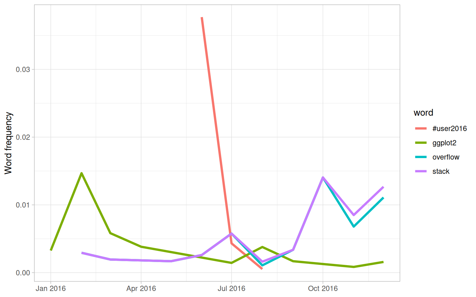
Figure 7.4: Trending words in David’s tweets
We see in Figure 7.4 that David tweeted a lot about the UseR conference while he was there and then quickly stopped. He has tweeted more about Stack Overflow toward the end of the year and less about ggplot2 as the year has progressed.
Me: I'm so sick of data science wars. #rstats vs Python, frequentist vs Bayesian…
— David Robinson (@drob) March 23, 2016
Them: base vs ggplot2…
Me: WHY WHICH SIDE ARE YOU ON
Now let’s plot words that have changed frequency in Julia’s tweets in Figure 7.5.
words_by_time %>%
  inner_join(top_slopes, by = c("word", "person")) %>%
  filter(person == "Julia") %>%
  ggplot(aes(time_floor, count/time_total, color = word)) +
  geom_line(size = 1.3) +
  labs(x = NULL, y = "Word frequency")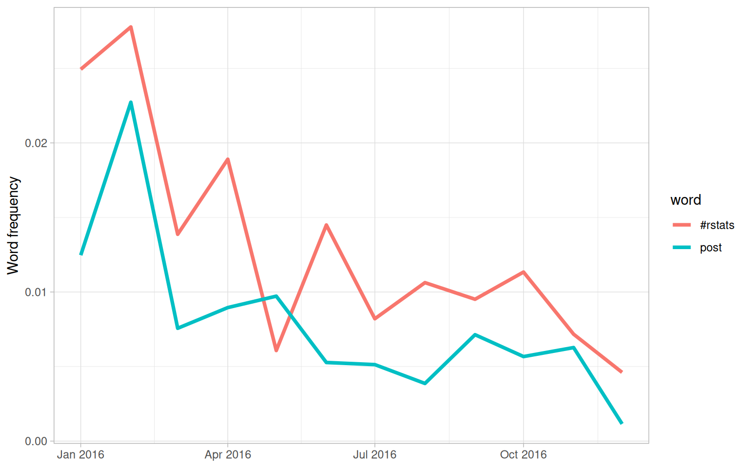
Figure 7.5: Trending words in Julia’s tweets
Both the significant slopes for Julia are negative. This means she has not tweeted at a higher rate using any specific words, but instead using a variety of different words; her tweets earlier in the year contained the words shown in this plot at higher proportions. Words she uses when publicizing a new blog post like the #rstats hashtag and “post” have gone down in frequency.
7.5 Favorites and retweets
Another important characteristic of tweets is how many times they are favorited or retweeted. Let’s explore which words are more likely to be retweeted or favorited for Julia’s and David’s tweets. When a user downloads their own Twitter archive, favorites and retweets are not included, so we constructed another dataset of the authors’ tweets that includes this information. We accessed our own tweets via the Twitter API and downloaded about 3200 tweets for each person. In both cases, that is about the last 18 months worth of Twitter activity. This corresponds to a period of increasing activity and increasing numbers of followers for both of us.
tweets_julia <- read_csv("data/juliasilge_tweets.csv")
tweets_dave <- read_csv("data/drob_tweets.csv")
tweets <- bind_rows(tweets_julia %>%
                      mutate(person = "Julia"),
                    tweets_dave %>%
                      mutate(person = "David")) %>%
  mutate(created_at = ymd_hms(created_at))
Now that we have this second, smaller set of only recent tweets, let’s again use unnest_tokens() to transform these tweets to a tidy data set. Let’s remove all retweets and replies from this data set so we only look at regular tweets that David and Julia have posted directly.
tidy_tweets <- tweets %>%
  filter(!str_detect(text, "^(RT|@)")) %>%
  mutate(text = str_replace_all(text, replace_reg, "")) %>%
  unnest_tokens(word, text, token = "regex", pattern = unnest_reg) %>%
  filter(!word %in% stop_words$word,
         !word %in% str_remove_all(stop_words$word, "'"))

tidy_tweets
#> # A tibble: 11,074 × 7
#>         id created_at          source            retweets favorites person word
#>      <dbl> <dttm>              <chr>                <dbl>     <dbl> <chr>  <chr>
#>  1 8.04e17 2016-12-01 16:44:03 Twitter Web Clie…        0         0 Julia  score
#>  2 8.04e17 2016-12-01 16:44:03 Twitter Web Clie…        0         0 Julia  50
#>  3 8.04e17 2016-12-01 16:42:03 Twitter Web Clie…        0         9 Julia  snow…
#>  4 8.04e17 2016-12-01 16:42:03 Twitter Web Clie…        0         9 Julia  drin…
#>  5 8.04e17 2016-12-01 16:42:03 Twitter Web Clie…        0         9 Julia  tea
#>  6 8.04e17 2016-12-01 16:42:03 Twitter Web Clie…        0         9 Julia  #rst…
#>  7 8.04e17 2016-12-01 02:56:10 Twitter Web Clie…        0        11 Julia  julie
#>  8 8.04e17 2016-12-01 02:56:10 Twitter Web Clie…        0        11 Julia  help…
#>  9 8.04e17 2016-12-01 02:56:10 Twitter Web Clie…        0        11 Julia  pyth…
#> 10 8.04e17 2016-12-01 02:56:10 Twitter Web Clie…        0        11 Julia  pack…
#> # ℹ 11,064 more rows
To start with, let’s look at the number of times each of our tweets was retweeted. Let’s find the total number of retweets for each person.
totals <- tidy_tweets %>%
  group_by(person, id) %>%
  summarise(rts = first(retweets)) %>%
  group_by(person) %>%
  summarise(total_rts = sum(rts))

totals
#> # A tibble: 2 × 2
#>   person total_rts
#>   <chr>      <dbl>
#> 1 David      13012
#> 2 Julia       1749
Now let’s find the median number of retweets for each word and person. We probably want to count each tweet/word combination only once, so we will use group_by() and summarise() twice, one right after the other. The first summarise() statement counts how many times each word was retweeted, for each tweet and person. In the second summarise() statement, we can find the median retweets for each person and word, also count the number of times each word was used ever by each person and keep that in uses. Next, we can join this to the data frame of retweet totals. Let’s filter() to only keep words mentioned at least 5 times.
word_by_rts <- tidy_tweets %>%
  group_by(id, word, person) %>%
  summarise(rts = first(retweets)) %>%
  group_by(person, word) %>%
  summarise(retweets = median(rts), uses = n()) %>%
  left_join(totals) %>%
  filter(retweets != 0) %>%
  ungroup()

word_by_rts %>%
  filter(uses >= 5) %>%
  arrange(desc(retweets))
#> # A tibble: 178 × 5
#>    person word          retweets  uses total_rts
#>    <chr>  <chr>            <dbl> <int>     <dbl>
#>  1 David  animation         85       5     13012
#>  2 David  download          52       5     13012
#>  3 David  start             51       7     13012
#>  4 Julia  tidytext          50       7      1749
#>  5 David  gganimate         45       8     13012
#>  6 David  introducing       45       6     13012
#>  7 David  understanding     37       6     13012
#>  8 David  0                 35       7     13012
#>  9 David  error             34.5     8     13012
#> 10 David  bayesian          34       7     13012
#> # ℹ 168 more rows
At the top of this sorted data frame, we see tweets from Julia and David about packages that they work on, like gganimate and tidytext. Let’s plot the words that have the highest median retweets for each of our accounts (Figure 7.6).
word_by_rts %>%
  filter(uses >= 5) %>%
  group_by(person) %>%
  slice_max(retweets, n = 10) %>%
  arrange(retweets) %>%
  ungroup() %>%
  mutate(word = factor(word, unique(word))) %>%
  ungroup() %>%
  ggplot(aes(word, retweets, fill = person)) +
  geom_col(show.legend = FALSE) +
  facet_wrap(~ person, scales = "free", ncol = 2) +
  coord_flip() +
  labs(x = NULL,
       y = "Median # of retweets for tweets containing each word")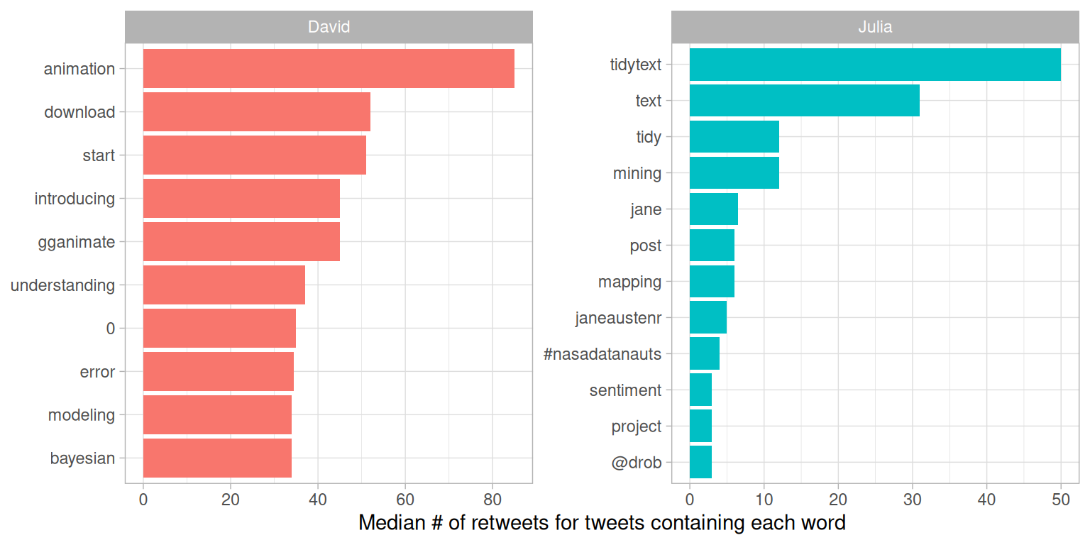
Figure 7.6: Words with highest median retweets
We see lots of word about R packages, including tidytext, a package about which you are reading right now! The “0” for David comes from tweets where he mentions version numbers of packages, like “broom 0.4.0” or similar.
We can follow a similar procedure to see which words led to more favorites. Are they different than the words that lead to more retweets?
totals <- tidy_tweets %>%
  group_by(person, id) %>%
  summarise(favs = first(favorites)) %>%
  group_by(person) %>%
  summarise(total_favs = sum(favs))

word_by_favs <- tidy_tweets %>%
  group_by(id, word, person) %>%
  summarise(favs = first(favorites)) %>%
  group_by(person, word) %>%
  summarise(favorites = median(favs), uses = n()) %>%
  left_join(totals) %>%
  filter(favorites != 0) %>%
  ungroup()
We have built the data frames we need. Now let’s make our visualization in Figure 7.7.
word_by_favs %>%
  filter(uses >= 5) %>%
  group_by(person) %>%
  slice_max(favorites, n = 10) %>%
  arrange(favorites) %>%
  ungroup() %>%
  mutate(word = factor(word, unique(word))) %>%
  ungroup() %>%
  ggplot(aes(word, favorites, fill = person)) +
  geom_col(show.legend = FALSE) +
  facet_wrap(~ person, scales = "free", ncol = 2) +
  coord_flip() +
  labs(x = NULL,
       y = "Median # of favorites for tweets containing each word")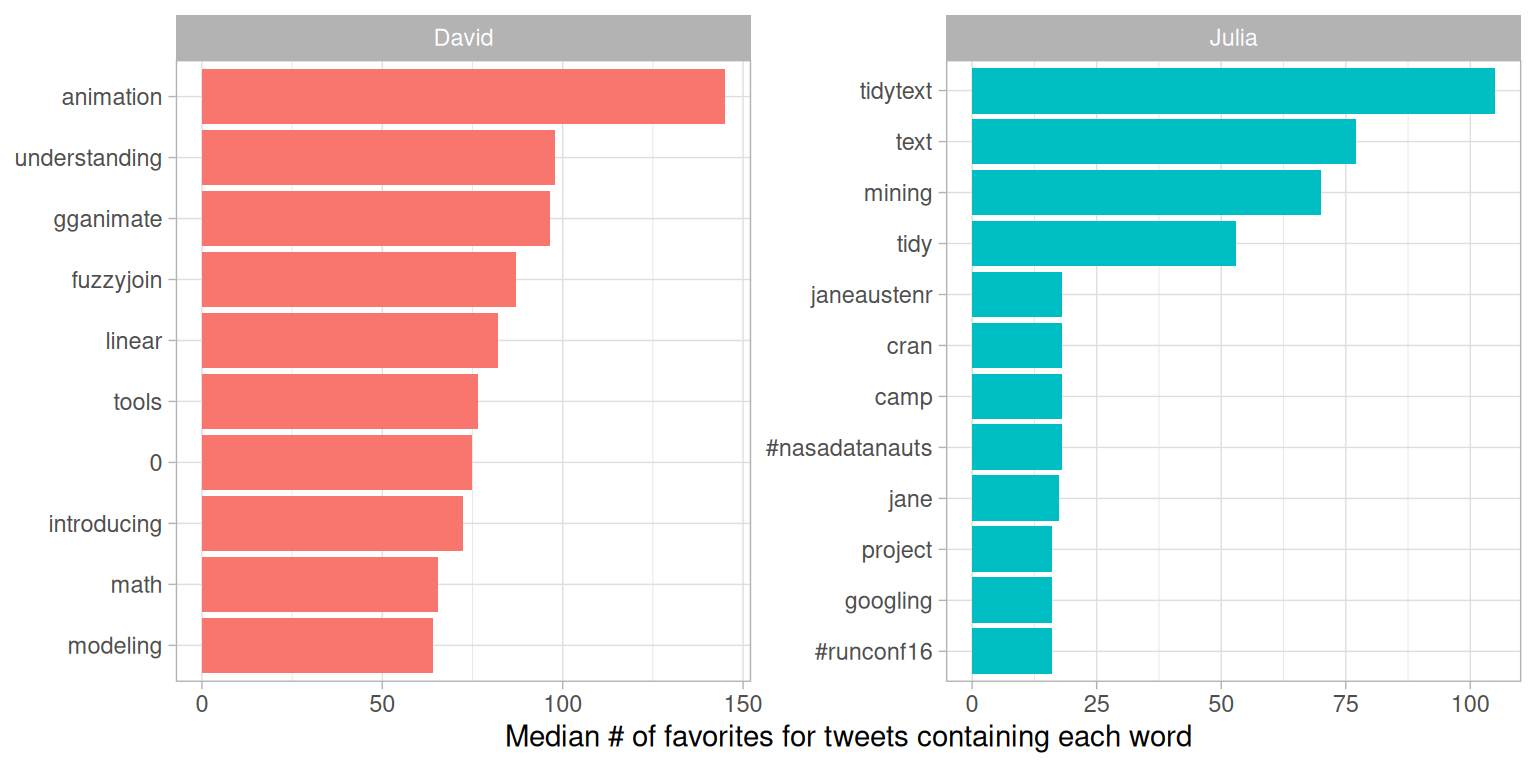
Figure 7.7: Words with highest median favorites
We see some minor differences between Figures 7.6 and 7.7, especially near the bottom of the top 10 list, but these are largely the same words as for retweets. In general, the same words that lead to retweets lead to favorites. A prominent word for Julia in both plots is the hashtag for the NASA Datanauts program that she has participated in; read on to Chapter 8 to learn more about NASA data and what we can learn from text analysis of NASA datasets. Wondering about the “=” in David’s list?
Me: You can't just add two p-values together.
— David Robinson ((drob?)) March 29, 2016
Dev: The hell I can't:
newPval = pval1 + pval2;
Me: But-
Dev: Is all statistics this easy
7.6 Summary
This chapter was our first case study, a beginning-to-end analysis that demonstrates how to bring together the concepts and code we have been exploring in a cohesive way to understand a text data set. Comparing word frequencies allows us to see which words we tweeted more and less frequently, and the log odds ratio shows us which words are more likely to be tweeted from each of our accounts. We can use nest() and map() with the glm() function to find which words we have tweeted at higher and lower rates as time has passed. Finally, we can find which words in our tweets led to higher numbers of retweets and favorites. All of these are examples of approaches to measure how we use words in similar and different ways and how the characteristics of our tweets are changing or compare with each other. These are flexible approaches to text mining that can be applied to other types of text as well.